Architecture and design
Zurich branch office for a global player, 2021
International corporation, Switzerland
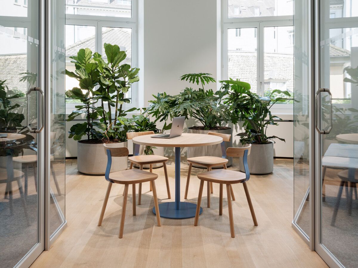
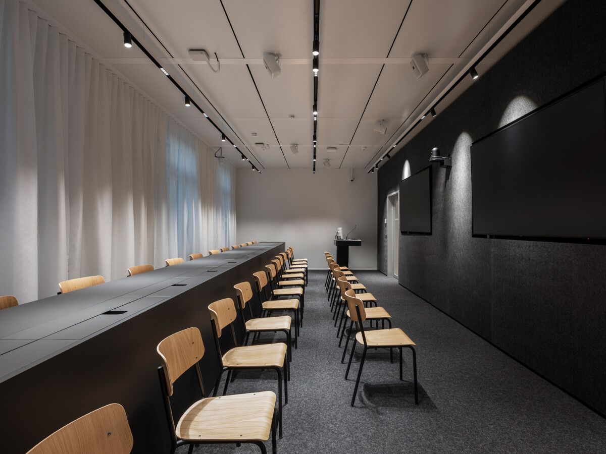
«How do we create an office with local charisma for a global player?» Stephan Hürlemann and his team addressed this question when designing the Zurich branch of an international information services, news and media corporation. Their aspiration was to come up with a contemporary Open Space Office with the latest technological interfaces. In doing so, they needed to adhere to international design guidelines – from the predefined room sequence to the deployment of certain products. An assignment which was made all the more complex by the context of the architecture: The 660 m2 office space extends in fragments over a row of three buildings on Zurich's Bahnhofstrasse. «In this corset of specifications, a lot of creativity and determination were required. Only this way were we able to create an office worthy of both, Zurich and the company», says Stephan Hürlemann.
In order to make a strong design statement, Hürlemann and his team developed a design story which served as a guide for formal decisions. They established the connection to Zurich by drawing inspiration from the style of the «Zürcher Konkreten». This art history period was influenced by the Swiss graphic design scene (which made it all the more fitting since the client uses a Swiss font in its logo). Wherever there was some leeway, they opted for geometric forms, strong colour accents and clearly legible lines, surfaces and spaces.
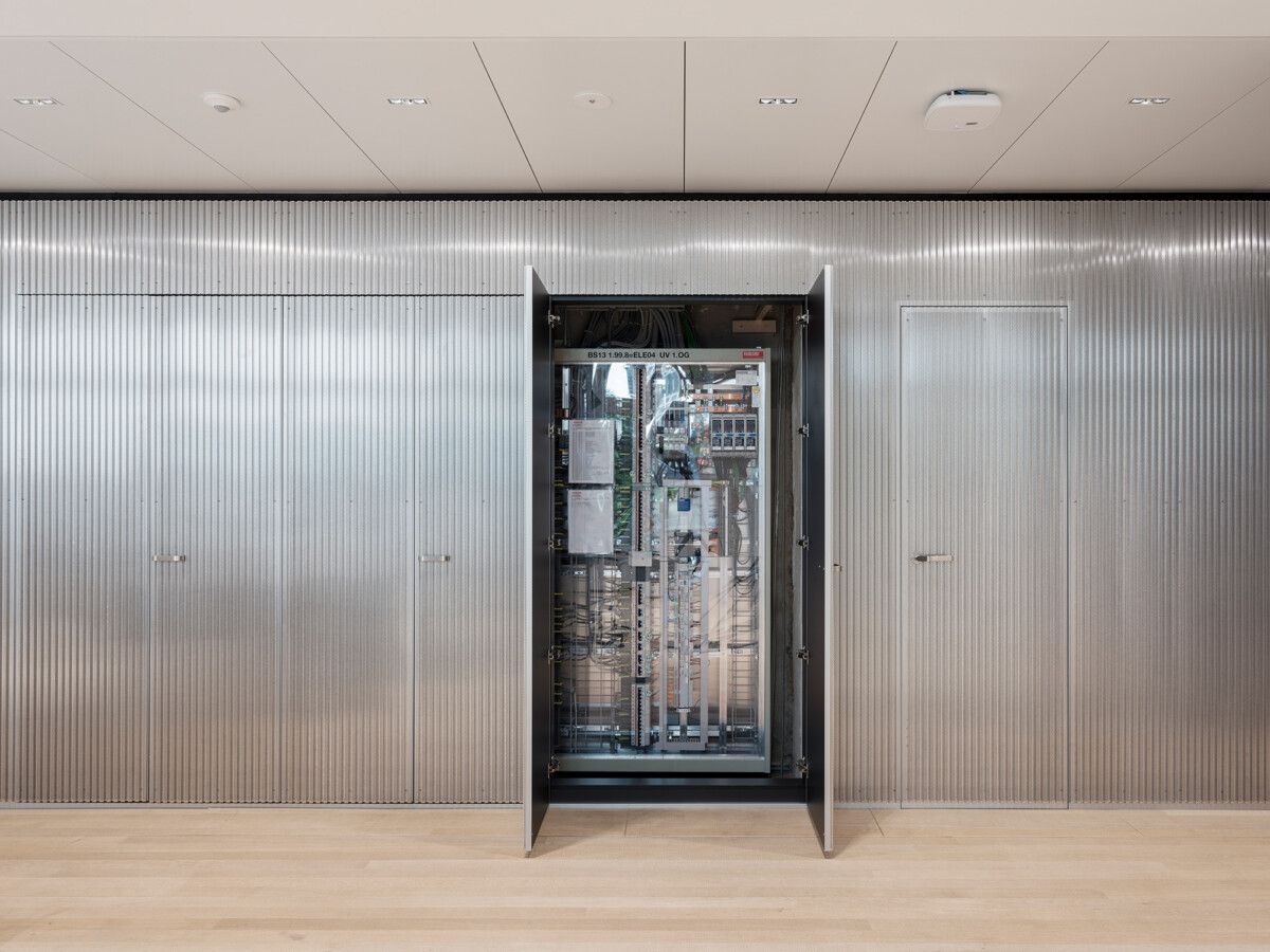
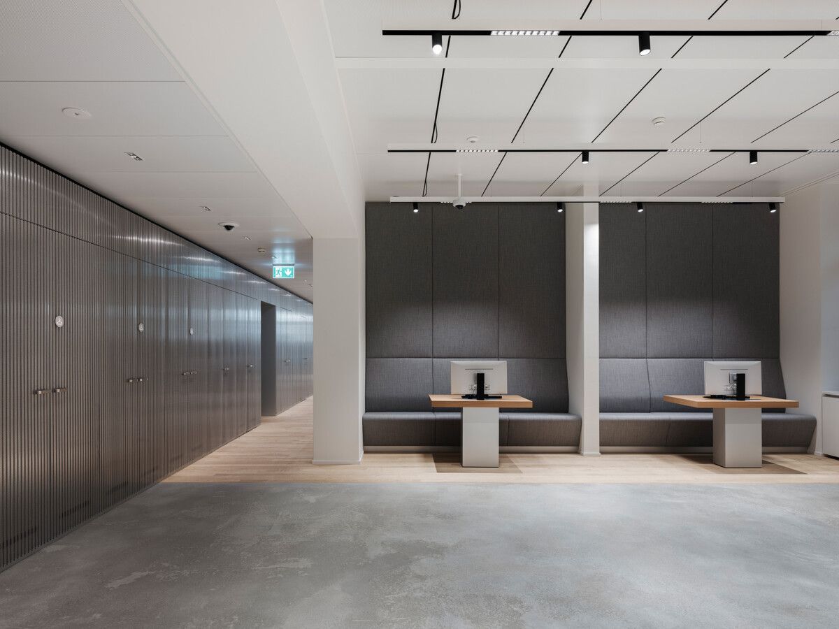
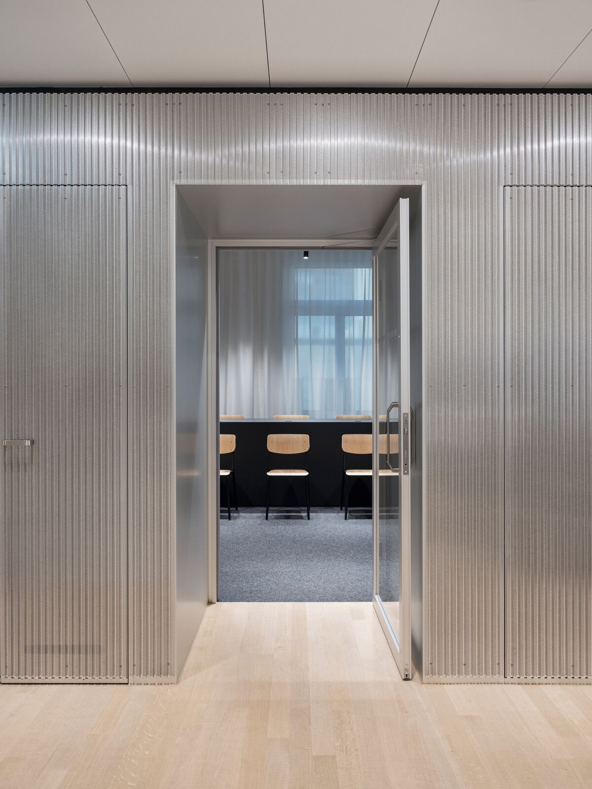
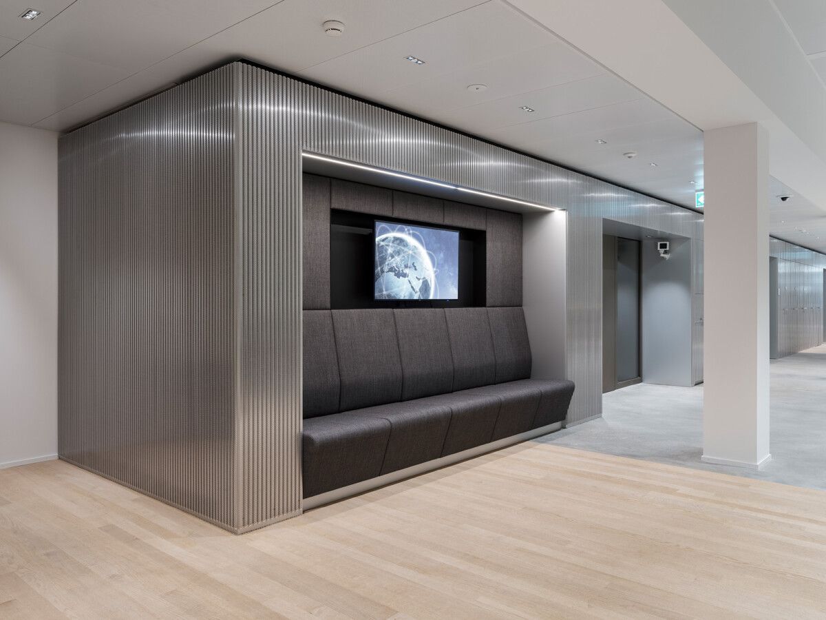
As a defining architecture element a multifunctional wall layer made of finely perforated corrugated aluminium sheet was developed. The so-called «backbone» connects all the houses’ parts and rooms and provides a continuous sensation of space.
The new material concept which features «authentic» materials that age well is also identity-forming. Carpentry furniture such as training desks for seminars, small kitchens for snacks, meeting tables, benches and built-in closets express the design story to the very last detail. The form language of these designs contributes to the unique character of the office branch.
Wall Graphics by NORM Zurich
Photos: Beat Bühler
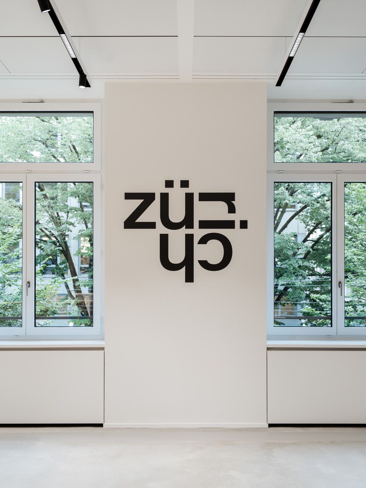
Graphics by NORM Zurich.
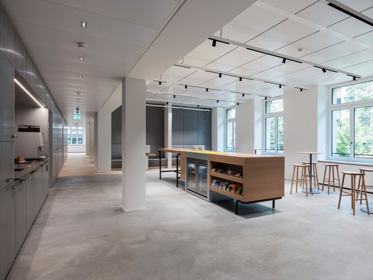
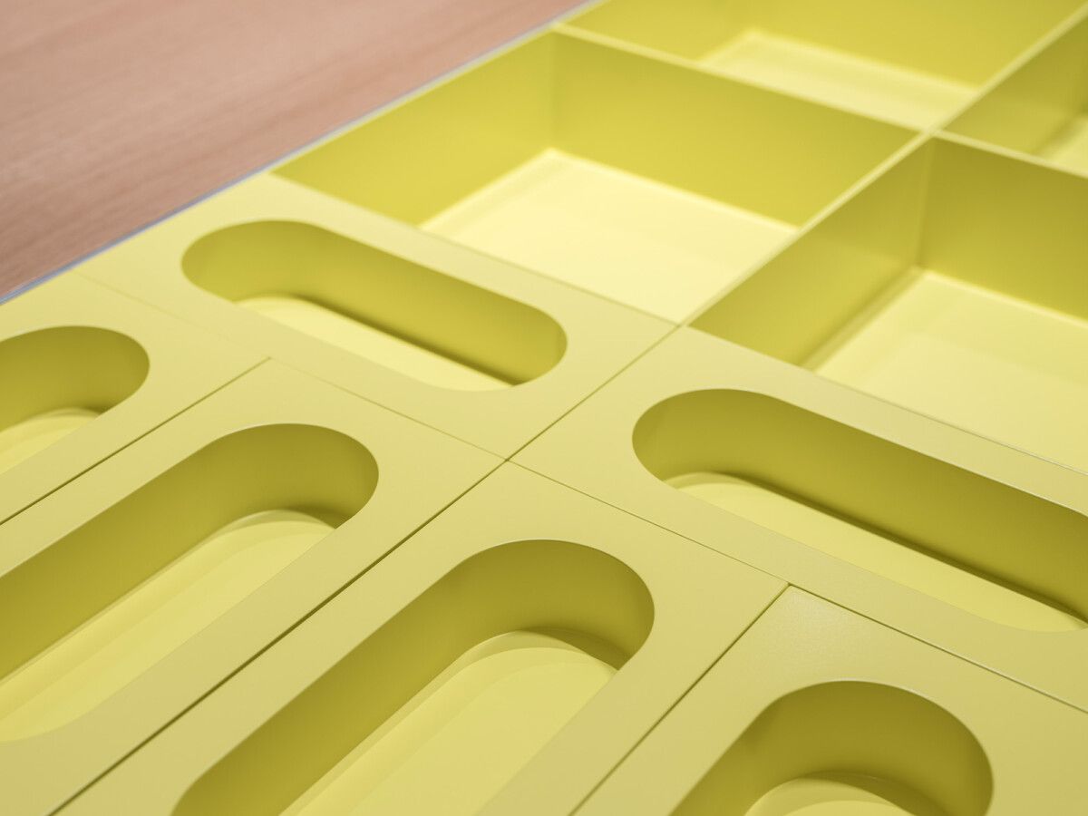
Table containers for catering.
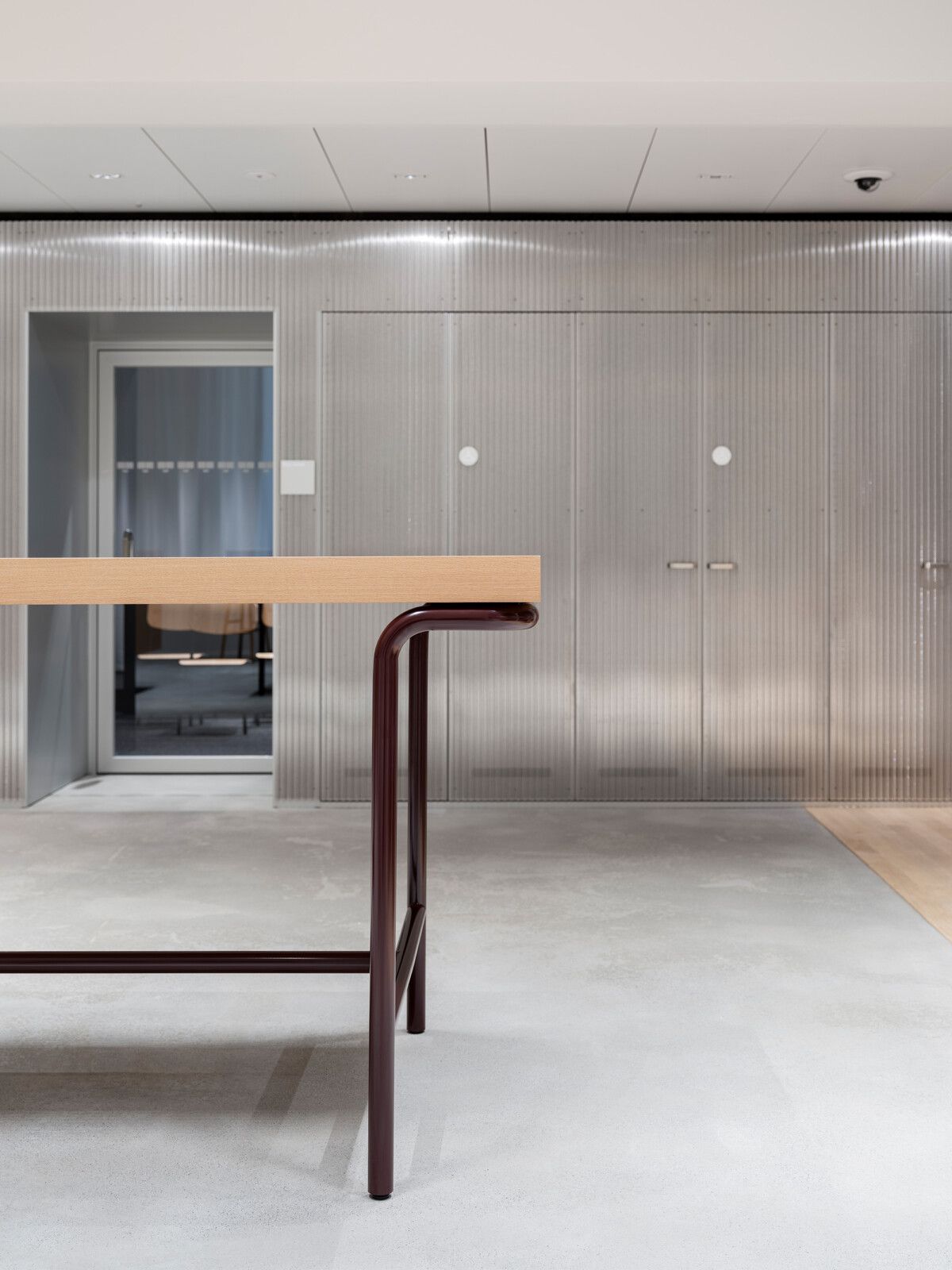
Bar table designed by Stephan Hürlemann.
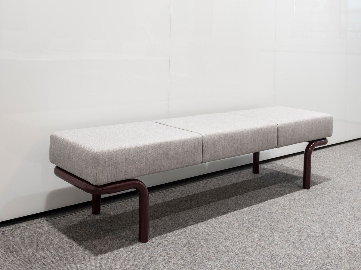
Bench designed by Stephan Hürlemann
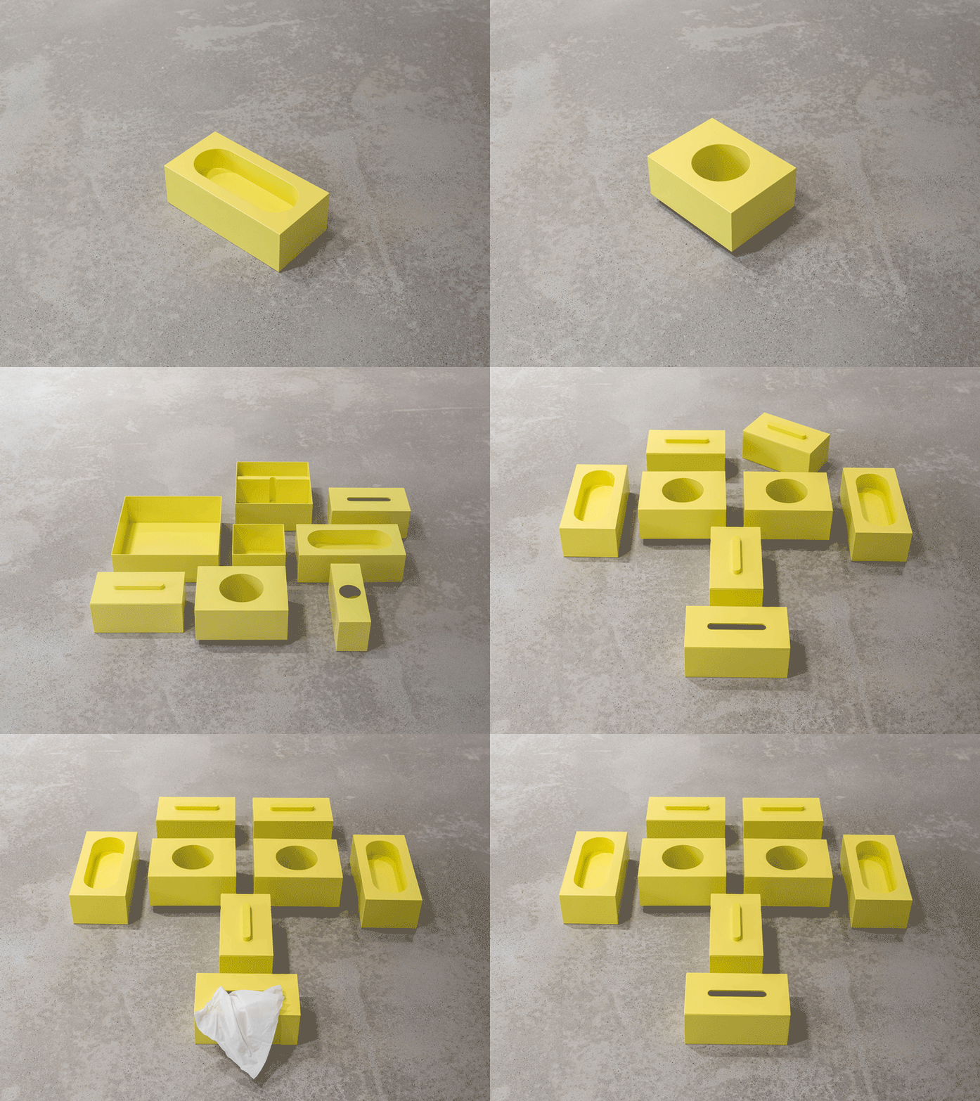
Designed by Stephan Hürlemann: Containers for catering, tissues and other useful things.

